Project Overview
A mobile app (iOS/Android) that lets customers pre-order coffee and food to skip lines. Key features: advance ordering, order history, table booking, and store locator.
The Goal
Design an intuitive app for quick ordering, table reservations, and pickup/delivery scheduling.
The Problem
Busy professionals and students don’t have time to wait—they need a faster way to order ahead.
My Role
End-to-end UX design: research, interaction design, prototyping, testing, and visual/motion design.
Year
2024
Timeline
6 weeks
Tools
Figma, FigJam, Adobe Photoshop, Adobe Illustrator, Paper + Pencil
RESEARCH & ANALYSIS
Research Summary
Combined user interviews (10 participants, including a hearing-impaired user) and secondary research (app store reviews, competitor analysis) to identify core pain points in café ordering.
Outputs
• Primary/secondary research synthesis
• User personas
• User journey map
• Empathy map
Key Findings
• Long wait times deter customers, with some abandoning orders.
• Unclear menus and customization options frustrate first-time users.
• In-person preference: A segment of users resisted digital ordering due to habit or social preference.
Initial Survey Insights
Key Observations
• 80% report excessive wait times
• 40% have abandoned orders due to queues
• 60% desire faster reordering of regular items
• 30% find menu customization unclear
• 20% prefer traditional ordering
Representative User Voices
• 80% report excessive wait times
• "Pre-ordering would save my rushed mornings" (Ethan, 34, Engineer)
• "Need to check seating availability beforehand" (Ava, 29, YouTuber)
• "Queues often force me to leave" (Chaos, 40, Lecturer)
User Personas
User Problem Statements
Caty Schulz
A time-pressed graduate student mother needs a faster, error-proof way to get her morning coffee without disrupting her tight schedule.
Alex Nowak
A hearing-impaired freelance designer needs a visual ordering system to reliably confirm café orders and reserve workspaces in noisy environments.
CONCEPT DEVELOPMENT
Information Architecture
To ensure a logical and scalable structure, I mapped out the full app architecture, including navigation, user account management, and ordering pathways:
Highlights:
• Clear divisions between ordering, favorites, and account functions
• Seamless access to order history and reordering
• Simplified cart and checkout path
User Flow
To support smooth ordering with minimal friction, I created a user flow for the key scenario: browsing, customizing, and scheduling a pickup.
Highlights:
• Supports both pickup and delivery
• Optional table reservation embedded in flow
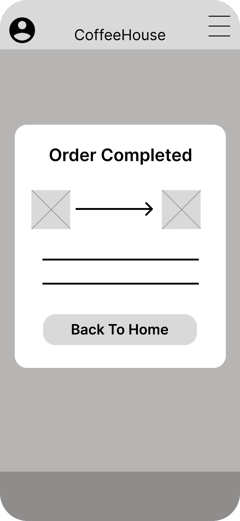
• Includes detailed checkout and confirmation steps
User Journey & Empathy Map
User Journer
Empathy Map
WIREFRAMING & PROTOTYPING & USER TESTING
Design Process Summary
Following initial user research, I moved into the design phase. I started by mapping out the app’s core flows in low-fidelity wireframes, which helped validate structure and usability. These were then tested through usability studies to uncover pain points and areas for improvement. Based on the findings, I iterated on the interface and developed high-fidelity prototypes for further testing.
Outputs
• Low-fidelity wireframes focusing on key flows
• Usability testing with 5 participants
• Key insights and actionable improvements
• High-fidelity clickable prototypes for validation
Low-fidelity wireframes
Usability Testing & Iteration
I conducted usability testing with 5 target users using early-stage prototypes. Each participant completed common user flows such as pre-ordering drinks, customizing items, and booking a table. Their feedback revealed several friction points and opportunities for improvement.
Usability Insights (5 participants)
• 4/5 users wanted a location feature with GPS
• 3/5 users requested the ability to schedule pickup times
• 3/5 users asked for a one-click reorder option
• 3/5 users felt the table booking page needed more details
• 4/5 users preferred lightweight customization instead of full-screen menus
DESIGN ITERATION
Usability Testing & Iteration
Based on usability testing insights, I made targeted design changes to reduce friction and improve key user flows. Each iteration aimed to address specific pain points revealed during testing—focusing on reducing cognitive load, speeding up interactions, and improving clarity.
Customization as Pop-Up Modal (vs. Full Page)
Before
The original design displayed product customizations on a separate full-screen page. This forced users to leave the order flow, adding unnecessary steps and breaking continuity.
After
Replaced with a contextual pop-up modal that overlays the screen, allowing users to customize items without leaving the current page
Why It Matters
• Reduces page transitions
• Keeps users in context
• Minimizes cognitive load
Impact
Faster customization, improved task flow, and a more seamless user experience.
Store Locator Redesign with “Near Me” Filter
Before
The initial version used a split-screen layout—map on top and scrollable store list below. Users found it difficult to associate locations with store info and lacked an easy way to find nearby cafés.
After
Redesigned to show a full-screen interactive map with a horizontal card slider for nearby cafés. Added a “Near Me” GPS filter to prioritize local results.
Why It Matters
• Enhances spatial clarity
• Enables quick location filtering
• Supports intuitive exploration
Impact
Quicker store selection, clearer map–list connection, and improved convenience for users on the go.
REFLECTION
Working on CoffeeHouse deepened my understanding of how small interaction changes—like customizing via a pop-up or simplifying the store locator—can significantly improve user flow and satisfaction. Designing for accessibility, especially for users with hearing impairments, reminded me that inclusive design is not a feature but a foundation.
What I’d do next:
• Expand testing to include non-digital natives and international users
• Explore voice-free interaction modes for greater accessibility
• Collaborate with developers earlier to refine edge cases in booking and customization logic


